A Precocious American Economy Must Now Pay the Price
Kondratieff was a Russian economist whose classic work in 1926 resulted in his name being associated with a cyclical phenomenon in world economy. By studying economic indicators Kondratieff deduced an economic cycle with period of about fifty years. His work was promptly challenged. Critics doubted both the existence of Kondratieff's cycle and the causal explanation suggested later by Harvard economist Schumpeter. The postulation ended up being largely ignored by twentieth-century economists for a variety of reasons. In the final analysis, however, the most significant reason for this rejection may have been the boldness of the conclusions drawn from such ambiguous and imprecise data as monetary and financial indicators. These indicators, just like price tags, are a rather frivolous means of assigning lasting value. Inflation and currency fluctuations due to speculation or politico-economic circumstances can have a large unpredictable effect on monetary indicators. Extreme swings have been observed. For example, Van Gogh died poor, although each of his paintings is worth a fortune today. The number of art works he produced has not changed since his death; counted in dollars, however, it has increased tremendously. In observing cycles with a period of fifty-six years I have cited examples in Predictions that are based on physical quantities. Energy consumption, the use of machines, the discovery of stable elements, the succession of primary energy sources, and basic innovations have all been reported in their appropriate units and not in relation to their prices. The cycles obtained this way are more trustworthy than Kondratieff's economic cycle. In each case to extract the cyclical behavior I have divided the data number by the corresponding level of the natural growth S-shaped curve of the general trend.
TEN YEARS LATER
As I am updating the predictions in Predictions
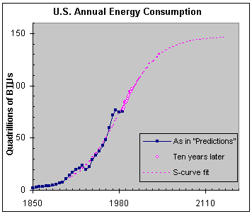
in view of re-launching the book ten years later, I realize that the economy in the US recovered too rapidly from what some people called the “great depression” of the early 1990s. There is no question that energy consumption (intimately linked to economic performance) increased significantly since 1985, see purple circles in Exhibit 3. Naturally, the economy and the stock markets followed suit.
Exhibit 3.
This figure was published in Predictions with data up to 1985. We now see 14 more yearly data points (purple circles). The dotted purple line describes the S-curve of the natural trend as originally published.At first glance, the growth of the US energy consumption during the last fourteen years seems to be exactly as predicted by the S-curve in Exhibit 3. However, looking more closely, that is, looking at the cyclical variation around the S-shaped trend, we find that the recovery from the stagnation of the 1980s came a little too soon, see Exhibit 4.
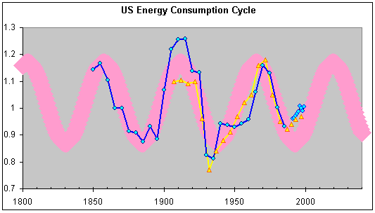
Exhibit 4.
This drawing was originally published in Predictions with data up to 1985. The blue-line graph is calculated from Exhibit 3 by dividing the data numbers by the corresponding level of the S-curve trend. A similar procedure for electric energy consumption gives the yellow line. We also see what happened to these two quantities since 1985, namely that they both turned upward. The regular wide-band oscillation (in pink) sketches Kondratieff’s cycle.Just as it happened with the rapid recovery from the depression of the 1930s—in that case accelerated because of the war—this time also the rapid recovery must be followed by a slow down in order to catch up with the natural rate of growth depicted by the wide pink band in Exhibit 4. The rapid-growth phase should normally pick up again around 2005. Only from them onward growth will be steady until the boom of the 2020s. In the meantime, it does not mean that energy consumption (and consequently the economy) must grind to a halt. It simply means that the growth rate will have to slow down and follow more closely the natural rate of the dotted line in Exhibit 3.
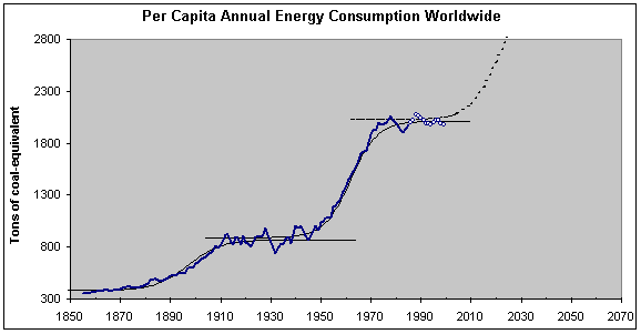
Exhibit 5.
This drawing was published in Predictions with data up to 1985. We now see what happened in the last 14 years (little circles). The first two S-curves are fits to the data. The dotted-line S-curve is a suggestion for a further future step by analogy to the previous two.There is a corroborating argument for an unavoidable slowdown in the US economy. Globalization necessitates that the US cannot be much out of phase with the rest of the world. The US economy cannot be churning along at galloping rates while the world economy has hardly begun recovering from the latest stagnating period. The graph of Exhibit 5 depicts a more austere indicator: world energy consumption per capita. And again we see the two major zero-growth periods during the last 150 years (the first one around the 1930s the second around the 1980s). We also see that the last fourteen years (small circles) have conformed to a flat stagnating pattern, the duration of which should by analogy be comparable to the previous one around the 1930s. The evidence seems to be compelling that the promised boom is not around the corner. The rate of US energy consumption should be significantly slower in the period 2000-2005 than it has been in the period 1985-1999. As expected, the economy and the stock markets will do the same, and I am not thinking here of the long-term forecast of Exhibit 1 that also anticipates a long stretch of time up ahead with no stock-market growth to speak of.