————————————————————————————————
Monthly Discussion
A Medium-Range Forecast for the DOW
From time to time I find it instructive to look at the DOW in a medium-range timeframe. This is particularly appropriate if we define as medium range 3 to 4 years, that is, a time period comparable to the lifetime of the “new” DOW born in November 1, 1999 when Microsoft, Intel, Home Depot, and SBC Communications replaced Chevron, Goodyear, Sears, and Union Carbide. One may argue that this major reorganization was tantamount to a mutation that changed the DOW into a different species and thus defined new sets of S-curves for its evolution.
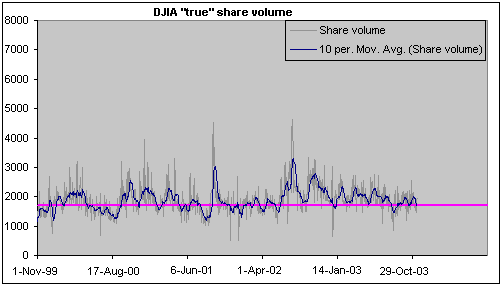
Looking at history only since November 1, 1999 we see in Exhibit 3 a rather horizontal evolution for the true share volume, i.e. the share volume corrected for stock splits. The best natural-growth curve that describes such an evolution is a straight horizontal line, the extreme end of an S-curve. The fit is rather good despite important upward deviations, particularly around the end of 2002 beginning of 2003.

Exhibit 3.
The DOW’s share volume (gray line) and its 10-day moving average (blue
line). The purple line shows a natural-growth fit, which in this case is a
simple straight horizontal line. The volume is “true” because it has been
corrected for stock splits.
The other “physical” component
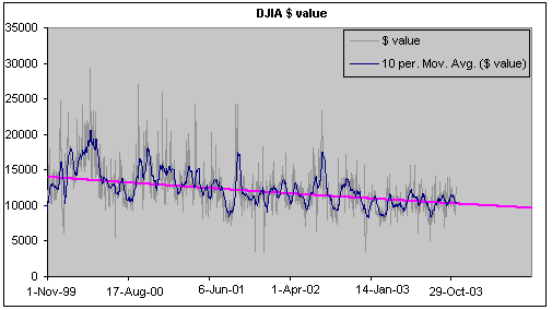
essential in the forecast calculation is the dollar value shown in Exhibit 4.
Here too a straight line gives a good description but now the line slopes
downward. In fact, the purple line in Exhibit 4 corresponds to the final stages
of an upside-down S-curve.

Exhibit 4. The DOW’s dollar value daily exchanged (gray
line) and its 10-day moving average (blue line). The purple line is a natural-growth
fit, which in this case is the end of a downward pointing S-curve.
We now have the
ingredients to calculate a medium-term forecast. It involves the ratio of the
purple lines in Exhibits 3 and 4, namely the dollar value divided by the share
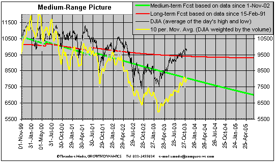
volume. The result is the green line shown in Exhibit 5 and forecasts the weighted
DJIA (that is, active stocks weigh proportionally more in the calculation of
the index).

Exhibit 5. The
weighted DJIA (yellow line) is calculated from the ratio of $ value divided by
share volume from Exhibits 3 and 4. Correspondingly the medium-range forecast
(green line) involves the ratio of the purple lines respectively in Exhibits 3
and 4.
Despite the general
agreement between green and yellow lines over the historical window a future
significant upward excursion of the latter is altogether possible just as was
the downward one in late 2002 early 2003.
The medium-range forecast slopes down more
dramatically than the other two forecasts shown in Exhibit 2. Is there a contradiction
here? I don’t think so. The
medium-range forecast indicates a decline of 2.1% per quarter for the weighted
DJIA. The correlation of the latter with the DJIA in the historical window
considered has R=0.90 meaning that 81% of what we see in one can be explained
by the other. So we may expect the DJIA to decline by 0.81 x 2.1 = 1.6% per
quarter for a while some time in the future. Can this be accommodated by the
gentler downward slope of the long-term forecast? I can think of the following
scenario.
The recovery seen in 2003 spills over in early 2004
reaching levels well above the forecasted ones. From then onward a steady
decline sets in (1.6% per quarter?) for a period of a year or two. By that
time, updated forecasts for the long-term and medium-term forecasts are likely
to be in tune.