————————————————————————————————
Monthly Discussion
Forecasting the DOW via the Divisor - Revisited
In the September
16, 2002 issue of this newsletter we forecasted the DOW in a different way, via
the divisor. Today we look again at this approach zooming into a little more
detail.
The average price of the 30 DOW industrials is the main ingredient in the
calculation of the DJIA. Interestingly this number does not change
significantly over time! An endless stream of stock splits has kept this number
more or less constant over decades. It was the corresponding decrease of the
divisor—also involved in the calculation of the DJIA—that was responsible for
the impressive growth of the market over the second part of the 20th
century.
Forecasting the Dow via the divisor was first treated in An S-Shaped trail to Wall Street and
later updated in this newsletter. The method is rather crude but our forecast
of more than two years ago proved not so bad after all, see Exhibit 3.
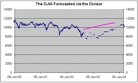
Exhibit 3. The graph is adapted here from the
newsletter issue of September 16, 2003. The purple line is the forecast as
published in September 16, 2003. The white dots show the subsequent evolution
of the DJIA.
Today we will focus in a more recent historical period during which the
market seems to have settled down to a state of “not much happening”.
For the calculation of the DOW JONES industrial index a simple arithmetic
average price of the thirty industrials is divided by the famous divisor. In Exhibit 4 we show how this index has
evolved over the last 15 months. But
another average price can be obtained as a ratio of the thirty industrials’
exchange dollar volume divided by their exchange share volume. This is an average price weighted by the
share volume and reflects more accurately the prices favored by investors
during the day. Just think of the fact that a little-traded high-priced stock
influences significantly the arithmetic average, unjustifiably so, if this
index is supposed to reflect the day’s market activity and investor trends.
Both calculations of the DJIA price result in generally horizontal
trends, see Exhibit 4, 3rd graph down. The weighted price (yellow) line is even flatter than the
arithmetic one (blue line). In fact, the
rise of the DJIA that made headlines during the month of November 2004 is not
corroborated by the more “truthful” weighted price. There is corroboration of
this rise by the share volume and the dollar value, see Exhibit 4, 1st
and 2nd graph, but this rise “evaporates” when we take the ratio
dollar volume to share volume (yellow line).
The horizontal character of all graphs in Exhibit 4 is striking. A 90-day
moving average is superimposed on each graph to better outline the trend. The top graph labeled “true” share volume
shows the share volume of the 30 industrials after corrections for splits. The
trend is generally horizontal but shows a rising tendency in the last three
months. Similarly, the dollar value exchanged over the 30 industrials, flat
horizontal for the most part, rises gently in the last three months. The ratio
of the two volumes gives the yellow line in the 3rd graph, which is
a trend utterly horizontal since June 30. The arithmetic average (blue line in
3rd graph) shows a rise in August, a decline in October, and another
rise in November, but all this activity, as much as it may provoke agitation in
the stock market, it is rather meaningless in terms of what is fundamentally
going on, which is not much!
As for the divisor, 4th graph, its trend is rock stable. A
safe bet is that it will continue like this for a while because no company
seems ready to split its stock in the near future.
CONCLUSIONS
One needs no fancy
forecasting techniques to predict that the share volume and the dollar value of
the DJIA will continue roughly on their horizontal course. With more confidence
one can say that their ratio (the weighted DJIA price) will continue its
horizontal trend. With still more confidence, one can assert that the divisor
will continue its horizontal trend. And there you have the forecast for the
DJIA, horizontal! Undoubtedly there will be short-term rises and declines of
the arithmetic average price that will reflect upon the daily DJIA, just like
those we saw in August, October, and November. But you can be sure these
excursions will “arrange” themselves so as to stay on a horizontal longer-term
trend.
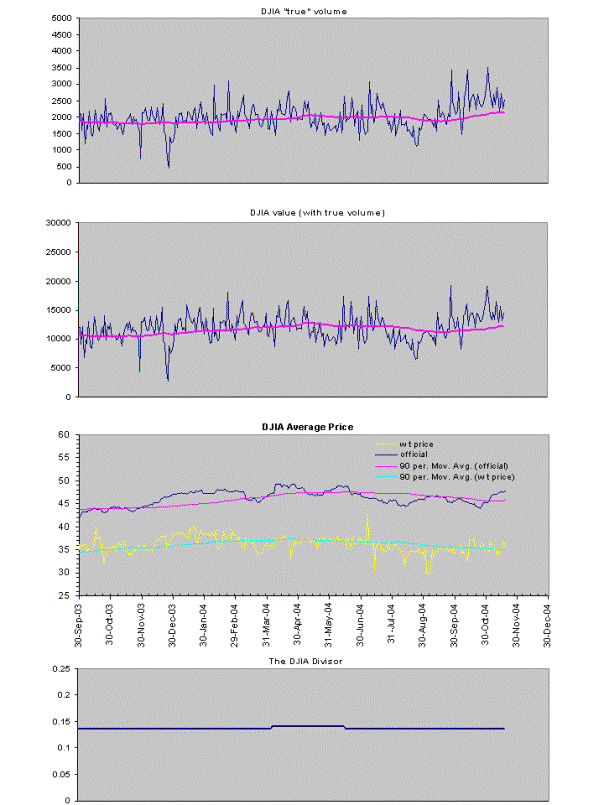
Exhibit
4. The smooth lines in the top three graphs
represent 90-day moving averages. The yellow line is the most realistic
representation of the average price as defined by investor activity.