Monthly
Discussion
The NASDAQ as
an Ecosystem
There
have been many requests for me to try the ecosystem approach on the NASDAQ. My
hesitation so far has been due to the fact that the NASDAQ is not as
well-defined a "species" as the Dow. The reasons are that the NASDAQ
is a relatively young market and still in the process of frequent mutation (too
many companies coming and going too often). Moreover, it has less of a culture,
less loyalty among its investors, and less consistent behavior than the Dow.
But with all these reasons weakening as time goes on, I will attempt here to treat
the NASDAQ as an ecosystem with data up to the end of November.
To begin we must once again turn our
attention away from prices and toward competitive variables, such as the share volume and the dollar value exchanged over NASDAQ
stocks. Exhibits 3(a) and 3(b) show the evolution of these quantities
respectively over the last ten years. The purple lines are natural-growth fits
(S-curve) on the data.
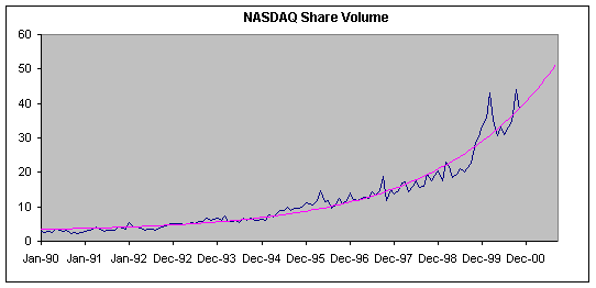
Exhibit 3(a). The share volume daily exchanged over NASDAQ
stocks. The data are reported monthly. The purple line is an S-curve fit.

Exhibit 3(b). The
dollar value daily exchanged over NASDAQ stocks. The data are reported monthly.
The purple line is an S-curve fit.
Despite spikes around the spring of 1999, the
overall trend in both variables is rising and amenable to a description by
S-curves (at least the early part of S-curves). However, one may want to see more
of a step pattern here, reaching a ceiling in early 1999, particularly in
Exhibit 3(b). But a low-ceiling S-curve cannot fit well the whole historical
range. If we are talking about a natural growth process since 1990, then the
purple line is the best fit. Of course, it could be that the NASDAQ underwent a
major mutation and became a totally different species in early 1999. In that
case this analysis would not be valid and my hesitation justified. But I don't
see any compelling reason to expect such an important mutation of the NASDAQ in
early 1999, so I will pursue this approach.
Diving dollar value by share volume
gives the average NASDAQ price, both
for the data and the S-curves. Thus we obtain a forecast for the price, see
Exhibit 4.

Exhibit 4. The average NASDAQ price and a forecast
obtained by dividing the curves of Exhibit 3(b) by those of Exhibit 3(a). The short
blue line is the Composite index during 2000, (read on the right axes.)
Because of the way it is calculated
here the average price is weighted by
the share volume. This price is correlated to the simple arithmetic-average
price defining the composite index. But the correlation is not as strong as in
the case of the DJIA. The correlation coefficient here is 0.8 implying that
only 64% of what we see in the Composite index can be explained by what we see
on the weighted-average price. We can visually appreciate this correlation in
Exhibit 5, in which we also see the long-term forecast for the NASDAQ Composite
index.

Exhibit 5. The
weighted-average price (purple line) is correlated to the Composite index
(green line). The long-term forecast (yellow line) is the same as in Exhibit 4
and forecasts the price. The data points are daily.
Despite NASDAQ's declining
trend during the last three months, the long-term forecast points the other
way. According to this forecast the NASDAQ composite index was 36% below the
level it should be at the end of November. Unlike the DJIA's stagnating
long-term trend (see Exhibit 1), NASDAQ's long-term future promises growth. By
the end of 2001 it should be around 5,000. The only worry about this forecast
is whether NASDAQ will continue behaving like a species reliably; as the Dow
does.